Covid Project - What 2 Watchlist
Project Motivation: Navigating The Streaming Explosion
As we unwind at the end of each day, the promise of streaming services like Netflix beckons us with a vast array of entertainment options. Yet, beneath the surface, lies a frustration familiar to many of us streaming connoisseurs. Browsing from one category to the next with the same movies showing up again and again. Thus you realize just how limited of a library your looking at. It’s a scenario not confined to one platform but pervasive across the streaming landscape.
The algorithms meant to assist us in our quest for the perfect show or movie often fall short, offering only a narrow selection of recommendations that fail to capture the breadth of available content. While undoubtedly helpful in surfacing relevant options, these algorithms sometimes serve as a barrier, obscuring the true extent of the library’s offerings.
I’ve found myself countless times resigned to choosing from the limited suggestions, even when I knew there must be more out there, somewhere in the haystack.
Building a Better Way
In a world where streaming services are abundant, yet content discovery remains a challenge, I embarked on a mission to reshape the way we engage with our entertainment choices. It dawned on me that empowering consumer choice was the key to unlocking the abundance of good content available for streaming. No longer would we settle for the limited offerings presented by a single platform’s recommendation algorithms; instead, we would harness the collective power of all available platforms.
Enter What 2 Watchlist: a revolutionary tool designed to transcend the limitations of individual services. With What 2 Watchlist, users can easily curate their personalized libraries by quickly grabbing some of the best blockbusters and finding those forgotten gems that are now streaming for free. We’re empowering users to take control of their entertainment choices. No longer constrained by algorithmic biases or platform exclusivity, viewers can explore the streaming world based on what they Want 2 Watchlist.
My Vision - Project Goals
- Search and view media details to quickly find recent blockbusters and timeless classics.
- Allow users to create personalized watchlists, ensuring easy access to their favorite content.
- Browse which streaming platforms offer the media on their watchlist, allowing for informed subscription decisions.
- Compare and rotate through streaming services to optimize content availability and variety.
- Implement privacy.com-like virtual cards to automate subscription management to automatically subscribe to the best content libraries.
- Bonus feature: Match watchlists for movie nights with friends, fostering shared viewing experiences and enhancing social connections.
Join me on this journey as we redefine the streaming experience and empower ourselves to take control of our entertainment choices. While existing services provide a content firehose for endless browsing, What 2 Watchlist offers a curated solution tailored to each user’s preferences and needs.
Development Journey
TLDR;
Discover the journey behind What 2 Watchlist by exploring its features firsthand. Visit What 2 Watchlist now!
Watch a comprehensive feature overview on my YouTube Playlist
Finding The Right API
The first step on the journey to build What 2 Watchlist began with an exploration of the various API options available. There’s a vast amount of movie websites but only a handful of providers for the type of data I was looking for.
Possible API Sources
While all of them had the basics, I needed something that had data on streaming availability and a publicly accessible API.
I dived right into development utilizing Reelgood as my primary API source. Their comprehensive TV and movie data collection included streaming data. It was everything I’d need but access to their API had been discontinued for public access. Undeterred, I delved into their well-designed REST API, leveraging developer tools to peek into HTTP requests to understand their API interface. This allowed me to play around and get a basic prototype running with search, browsing streaming services, and a lobby system. I knew this would have broken some terms and conditions to publish an app that was piggybacking off of someone else’s service without permission.
Now that I knew my goals for the app were possible, I’d need to find the same data in a publicly accessible and sustainable API before I could publish the app. Enter TMDB, walking in as the good guys, with overall generous terms and a flexible free-use option. While they were initially lacking streaming data, TMDB later partnered with Just Watch as a data source for integrating streaming availability into their API.
App Development
Embarking on any project requires a thoughtful selection of tools and frameworks tailored to the task at hand. As a solo developer, the efficiency and effectiveness of these choices significantly influence the project’s trajectory. For me, prioritizing tools that facilitate rapid development without compromising functionality was essential, allowing me to focus on actual implementation rather than getting bogged down in tedious tasks.
The Base Tool-Set
In pursuit of these goals, I turned to the familiar landscape of the npm and Node.js ecosystem. Harnessing my familiarity with JavaScript, I initially opted for Meteor.js, a versatile framework renowned for its expediency in crafting Progressive Web Applications (PWAs). Meteor.js offered an integrated environment that streamlined development, boasting a publish-subscribe model that seamlessly bridged the gap between client and server. With its robust user-accounts package and JavaScript-centric architecture, Meteor.js provided a solid foundation for realizing the vision of What 2 Watchlist.
Utilizing Meteor.js and a reliable data source from Reelgood, I swiftly laid the groundwork for the application’s core functionalities. Within a short span, users could join the platform, create personalized watchlists, and seamlessly browse streaming availability. An example of what can be achieved when proficiency meets powerful tools.
Going From Prototype to Published
However, as the project progressed, the need for a more robust and compliant API became apparent. Transitioning to TMDB not only ensured adherence to legal standards but had also broadened the application’s functionality. With TMDB having similar but well documented data, I now had easy access to the global availability of streaming data. Now users could browse through the global market for streaming content. Know not just what was streaming but where it was streaming. The integration of TMDB represented a significant milestone, unlocking new possibilities and broadening the app’s appeal.
Bonus Lobby
With the core functionalities of the application established, attention turned towards more complex functionalities. Among these was the development of a movie night lobby, designed to facilitate collaborative movie selection among friends. This bonus feature took priority, the other features had some liability concerns I’d need to address before publishing. Despite its seemingly straightforward premise, the implementation posed several challenges. While Meteor has many built in features to sync data from the server a lobby requires some transactional synchronization on the server. I had to make sure the backend server code was being executed asynchronously and accurately relaying if the lobby is waiting for people to join or already in progress. Nonetheless, perseverance, a whiteboard and innovative (hacky) problem-solving ultimately led to the successful realization of this feature, but the overall feature complexity would have me revisiting the code base again and again later on down the line. Overall this gave users a great way to engage with the app by quickly comparing movie interests with friends.
The Road to Virtual Cards
As the project approached its final stages, attention turned towards deployment readiness and the potential/hurdles of monetization through virtual card features. After sharing the app with a select group and doing some research, I discovered Privacy.com was rebranding to Lithic. Expanding their platform to give businesses the abilities for virtual card issuance and management services.
This was precisely the service needed to implement virtual cards for automating subscription management. Recognizing this as potentially the killer feature of this app, development efforts swiftly began on this feature. Utilizing Lithic’s sandbox environment, initial steps were taken to establish user sign-up processes, and explore API calls for the card management functionalities.
However, before fully incorporating virtual card functionality, it was essential to establish a robust system for tracking and managing user subscriptions. Envisioning the manager acting as a monthly value checkup where users would chose their best subscription options. Thus, focus shifted towards facilitating informed decision-making on streaming services. This involved curating a selection of popular streaming services, gathering data on pricing and available plans, and developing tools for comparing and evaluating each service’s offerings.
The ultimate goal was to empower users to effortlessly manage and optimize their subscription choices based on their individual viewing preferences. With the groundwork laid for subscription management services, the path towards integrating Lithic’s virtual card API for seamlessly subscription hopping could now start to crystallize.
The pursuit of virtual card integration and subscription management presented a sizable amount of work that was a few layers in, making it likely to only be used by power users. Considering the liability concerns around handling other peoples money this did not reach a completion stage, but a proof of concept stage. I’d gone and implemented the majority of features needed just to verify that it was possible.
Despite the promise and potential of virtual card integration, the endeavor presented a measurable amount of work and complexity. Liability concerns surrounding handling other people’s financial transactions added an additional layer of scrutiny. As a result, while a proof of concept was achieved, reaching a full implementation stage remained a work in progress. Nonetheless, there is still a sense of excitement surrounding this feature, leaving open the possibility of revisiting it to enhance the user experience and monetize this project.
Revamping UI Experience
Moving beyond functionality, my attention now directed towards enhancing the application’s user interface and experience. Recognizing the lack of visual appeal in a white background and interactive text, I would need a complete UI overhaul. I evaluated various UI frameworks and ultimately chose Semantic-UI for its strong documentation + examples, a sleek UI, with a full suite of customizable components and most importantly it was free.
After seeing all that Semantic-UI had to offer I had a clear picture of where and how I could use its components to improve the user experience. The meticulous process of redesigning and refining each page yielded a transformational result, elevating the overall aesthetic and usability of the application. Semantic-UI proved to be a strong library where the developer experience was as good or better than most of my previous experiences; where I’d just throw bootstrap classes at the project and call it a day.
Security
With the majority of milestones achieved and the app nearing readiness for public release, emphasis was placed on fortifying its security and accessibility. Measures such as user rate limiting, HTTP header permissions, and server hardening were implemented to safeguard user data and mitigate potential vulnerabilities. Furthermore, the adoption of HTTPS encryption via Nginx and Let’s Encrypt ensured secure communication channels, reinforcing user trust and confidence in the platform.
Publish
As the journey of prototype to publication draws to a close, What2Watchlist became publicly accessible. With all project goals accomplished, except for virtual card integration, (The potential liability of this feature was too high for something that’s currently just a portfolio project.) Nonetheless, I am truly satisfied by what I have accomplished.
As a portfolio project it showcases the growth I have experienced embarking on a meaningful solo development project. The project represents the culmination of months of hard work overcoming various challenges and learning valuable lessons along the way. The progress made thus far stands as a testament to the power that all software developers are capable of harnessing through perseverance and foundational problem-solving skills.
Re-Evalueate Re-Factor
After completing my sprint to get What 2 Watchlist hosted publicly, all the tasks sitting on the back-burner could now be addressed. I recognized several quality-of-life improvements and technical changes that could enhance the project overall. One of the foremost changes involved transitioning from the Meteor frontend to Vue.js. The default frontend framework in Meteor, Blaze, left me frustrated due to its lack of reactivity, leading to excessive boilerplate code that became tedious to manage.
Upon evaluating reactive frameworks, I compared Vue.js and React.js. Vue’s familiar syntax and straightforward component framework resonated with me, especially when compared to React’s more unstructured design. Vue’s concise tutorials and shorter learning curve ultimately solidified my decision to adopt it over React, despite React’s broader industry adoption.
However, transitioning to Vue was not without its challenges. I encountered dependency errors that required thorough investigations to resolve, as documentation for Meteor and Vue integration was limited. Showing just how important having a large community is when encountering development hurdles. Despite any regrets about not choosing React, I persisted and successfully ported the UI to Vue components.
In this process, I discovered the Element Plus UI library tailored specifically for Vue. Its extensive collection of UI components, along with customizable hooks for seamless integration, proved invaluable in enhancing the app’s visual appeal and functionality.
Modifying complex sections such as the lobby and decoupling the default account sign-in page posed significant challenges. While the lobby’s intricate code necessitated careful evaluation with each modification, the sign-in page at least had an MIT-licensed example project to use as a starting point.
Quality of Life Improvements
- Popular titles
- Curated list of blockbusters
- For each year since 2005
- UI cleanup
- Unappealing card borders removed
- Color icons for Add-remove action
- Icons: for navigation, help and highlighting things
- Anything else with rough edges
- Improved media details for where to find media streaming
- Streaming manager drawer
- To easily hide or access of the streaming services you’re interested in comparing
- Element UI tables
- Sort streaming service metrics based on user choice
- Watchlist creation without creating an account
- porting some UI elements to the new library for code consistency
- backend unit tests
As I continued refining the app, I began reassessing certain components of Meteor, gradually reducing reliance on the platform in favor of tools with larger communities. I found myself navigating through dependency hell one too many times, encountering libraries that were broken in the latest versions or had conflicting dependencies. All of these factors can be frustrating, especially when you’re eager to dive into coding and move the project forward.
Then, Vue 3 emerged onto the scene, prompting me to explore its capabilities. In the spirit of learning, I decided to port the UI once again. However, another code rewrite shed light on the possibility that React might have been a more suitable choice in the long run. With its seamless development experience, longstanding development paradigm, and widespread industry adoption, React appears like it would have offered a smoother path forward compared to Vue. Nevertheless, this project serves as a valuable learning experience, allowing me to compare and contrast the trade-offs between these two technologies.
Development Blocks and Push Through to Publish
Initial Project Rush
The inception of this project coincided with a surge of motivation spurred by the initial onset of the Covid-19 pandemic. It was a time ripe for focused work, with the opportunity to channel my energy into a project that deeply motivated me. Progress was swift, and despite initial concerns about utilizing the Reelgood API, the allure of creating a compelling portfolio piece and the sheer enjoyment of the development process carried me forward.
Covid-19 Pandemic Struggles
Regrettably, the initial burst of productivity was short-lived. As my roommates and I reached the end of our lease, we dispersed to stay with family members, disrupting my development momentum. While I’m grateful for my family’s support, adjusting to a different environment, marked by what I affectionately term “retirement decline,” posed its challenges. The perpetual background noise of low quality TV speakers blaring CNN, made it challenging to concentrate on programming. Consequently, months stretched into nearly a year before I could muster the determination to resume work on the project. Nevertheless, this hiatus wasn’t entirely unproductive, as I undertook several side projects to gradually regain momentum.
Side Projects
- Constructing a desk
- Converting a bike into an e-bike and designing/building a battery
- Upgrading a 3D printer
- Developing a 3D-printed tool for putting on dog booties
- Creating 3D-printed arch supports using photogrammetry
- Installed Home Assistant on my NAS for automated lighting
External concerns also contributed to development pauses, with access to a publicly available API and liability issues surrounding virtual card management services being significant hurdles. These interruptions, though lengthy, often faded from memory during periods of productivity, only to resurface as familiar roadblocks. Fortunately, breakthroughs came with the expansion of TMDB’s API to include streaming data and the emergence of Lithic’s public API for virtual card management, providing renewed hope for the project’s fruition. However, the realization that certain Lithic features were restricted to enterprise customers was a setback, dampening my hopes to reach feature completion but not extinguishing my development enthusiasm.
Pushing Through
Participating in a Devember coding event hosted by the Level1Tech forum injected a shot of adrenaline into the project. The camaraderie and accountability fostered in this environment propelled me forward, enabling me to surmount my anxieties and focus on delivering tangible results. The culmination of this effort was a publicly accessible site of which I am immensely proud, serving as a testament to the power of perseverance and determination.
Post-launch, my enthusiasm remained undiminished, fueling efforts to enhance the project further. I embarked on a journey to learn about reactive UI frameworks, driven by a desire to leverage whats become the new common industry tool-set to elevate the project’s quality. The accolades received, including recognition from Wendell at Level1Techs, provided validation for the hard work invested in the project. However, the realization dawned that sustained motivation requires long-term results, a domain where my strengths as a developer may not necessarily align with the marketing acumen required to grow the app’s user base.
Reception
Despite efforts to share the app with different groups or create video tutorials showcasing What2Watchlist’s features and benefits, user acquisition remained elusive. Many people who looked at my app would say, “oh, that’s really cool,” but it never translated into them trying it and providing feedback. Being privacy-minded, I refrain from injecting any app tracking to monitor user behavior, making it difficult to gauge user engagement accurately. It’s uncertain if any users other than myself exist, but if any do, they seem to engage only at the surface level and are not motivated enough to seek added benefits with an account. Being in a position where I want my efforts to be recognized, ongoing development has been halted until I can attract enough site traffic to drive user sign-ups, necessitating a shift towards basic site maintenance.
Lessons Learned
In retrospect, while there are lessons learned and areas for improvement, this project has been invaluable in fostering personal growth and resilience. It serves as a testament to the importance of dedication and perseverance, demonstrating that if you believe in something, go reach for it; with perseverance, you’ll find yourself reaching farther than you thought you could have. This underscores the importance of stepping beyond one’s comfort zone while also acknowledging the limitations of certain skill sets that may not be fully developed. While this project was a solo endeavor, the challenges of the Covid-19 pandemic highlighted how the social nature of teamwork breaks down many project roadblocks. During solo development, catching the right flow state was like lightning in a bottle, powerful but unable to guide itself perpetually. Being social creatures, it’s essential to find the right team where you can lean on others, bounce ideas, and collectively create a shared vision. ChatGPT is a helpful tool, but it cannot replace the wisdom and synergy that come from a well-functioning team.
Feature Highlights
Home - Search
One of the first features was the search bar, Initially button-activated it was quickly replaced with an event driven implementation that would execute when typing in the search field. That bare bones first attempt at reactivity would trigger from the first keypress to the last, initiating successive search request that updated the screen faster than it could be consumed. To address this, a character limit of three was implemented with a makeshift debounce to prevent premature searches and improving usability. Eventually I ran into the right tutorial to learn the name for this feature was debounce and I found the built-in functions to simplify my code.
Media lists form the backbone of any watchlist/streaming app, thus their development was a focal point. Initially, separate implementations were utilized, leading to redundant code. As the project expanded, a consolidated approach emerged, with a robust media list component supporting various data sourcing methods. Omiting pagination early on resulted in limited search results and a notable lagg arising from loading large watchlists. After discovering the Element-Plus library’s infinite-scroll feature; I knew it would be an elegant solution to effortlessly add pagination into the existing code base, by seamlessly loading additional results as users scrolled.
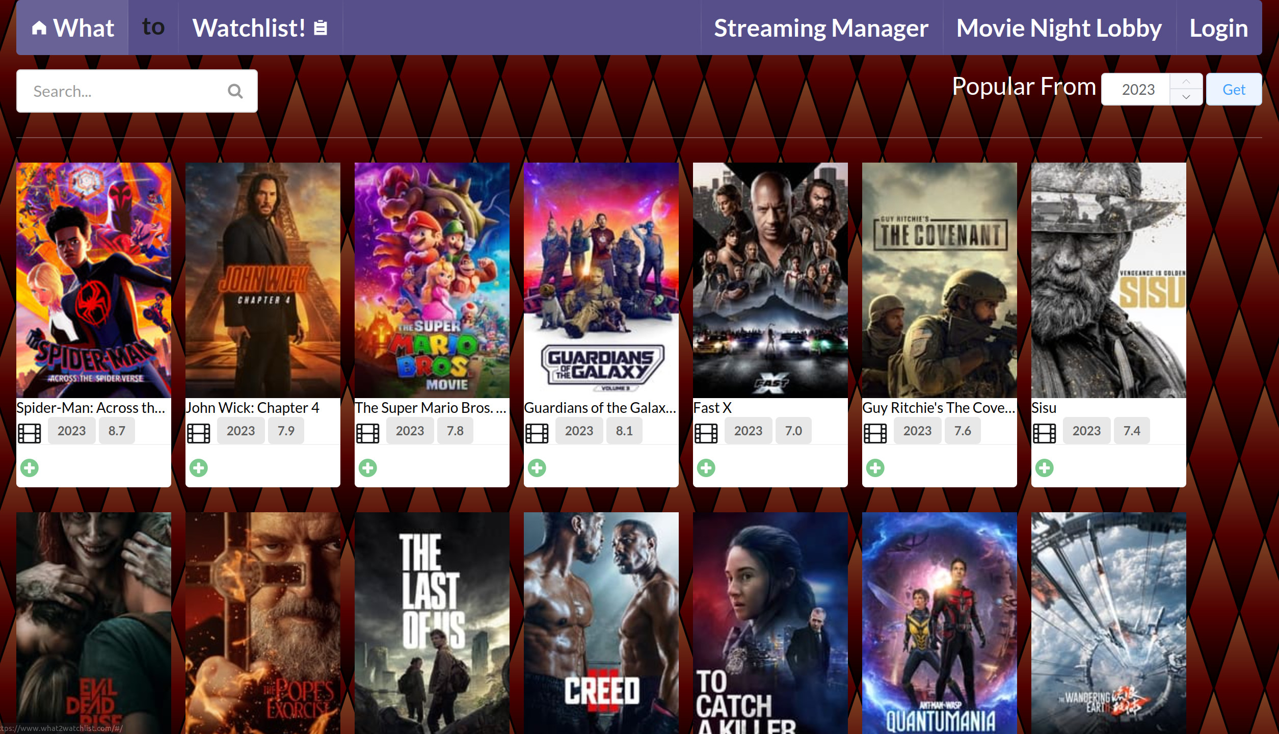
The introduction of cards transformed media lists from basic HTML UL tags into visually appealing components. Each card showcased a movie or show poster along with essential details, such as release year, rating, and media type. Including new icon based buttons to simplify watchlist management, with a green plus for add and a red minus for remove. Using TMDB’s CDN all the poster images could point directly to the source, relieving any development concerns.
The popular media feature aimed to streamline watchlist creation by offering curated lists of top titles from recent years. Using TMDB, I initiated queries for popular titles from 2005 to the present, targeting the highest-rated and most-viewed content. However, I soon encountered some unexpected results. One instance involved an obscure war documentary, boosted to the top by a single perfect rating, skewing the results. Another peculiar case was a Japanese movie titled “semen demon,” where it looked to be popular because of a shocking title and half naked woman on the cover. Reminding me of something a google engineer said people click on boobs and I’ve seen the data to back it up. The low rating and small amount of reviews made me certain that this was an outlier that needed to be removed. By implementing minimum thresholds for user engagement, I was able to filter out such outliers to get a curated selection of high-quality content for building a watchlist.
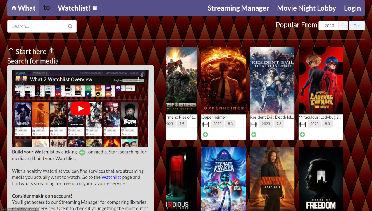
The addition of an introductory video on the homepage served as a user-friendly guide to What2Watchlist and its features. This multimedia approach, coupled with informative text, would ensure that users had the chance to get well-acquainted with the app’s functionalities from the outset.
Users and Watchlists
One of the primary reasons for choosing Meteor initially was its seamless user account creation functionality. Knowing not to roll my own security, I was happy to use a robust authentication systems that was directly supported by the Meteor project team. Setting up user accounts was a breeze, requiring minimal additional effort beyond importing and implementing the accounts package. With this in place, I could focus on features for tracking user watchlists and configuring SMTP for email signups.
I turned to focus my efforts on developing the necessary MongoDB queries to effectively store each user’s watchlist. My goal was to store watchlists as a set or map data structure, facilitating efficient movie lookup within the watchlist. This required a non-standard use case, necessitating dynamic key insertion in the MongoDB query syntax. After searching through forms and scouring MongoDB’s documentation, I discovered a suitable syntax for incorporating variables into query paths:
1
{$set: {['userProfile.watchlist.' + id]: imdbNum}}
Once the basics were in place, SMTP setup was the only thing remaining before the accounts were release ready. Initially considering self-hosting an email server for my domain to cut costs, I was deterred upon learning that unverified servers often end up in the spam folder. Fortunately, I found a fitting solution in Zoho Mail, a reputable service offering free email hosting.
While these steps ensured stability for the app’s release, some quality-of-life improvements were implemented post-launch:
- Watchlists could be built locally and transferred to the server when you’re ready to make an account
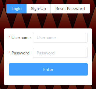
- Creation of a dedicated page for user login and signup services
- Gradual transition away from reliance on some of the default Meteor accounts library features
Media Details
From its inception, the design philosophy for this page has remained focused on simplicity. Initially intended for users to view the poster artwork and browse through details pertaining to a movie or show. It wasn’t any more than needed, just checking the box to say, I recognize it’s a necessary component for an app centered around films and TV-shows.
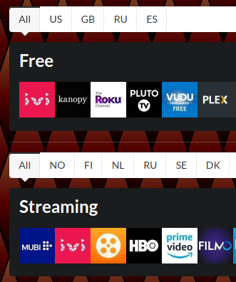
The commitment to simplicity persists, even after receiving some styling upgrades from the inclusion of a new UI library and introducing streaming availability details. This new feature distinguishes between streaming services, indicating weather the content is accessible for free or requires a subscription, while also specifying the region where the streaming service is offering this title.
Watchlist - Browsing
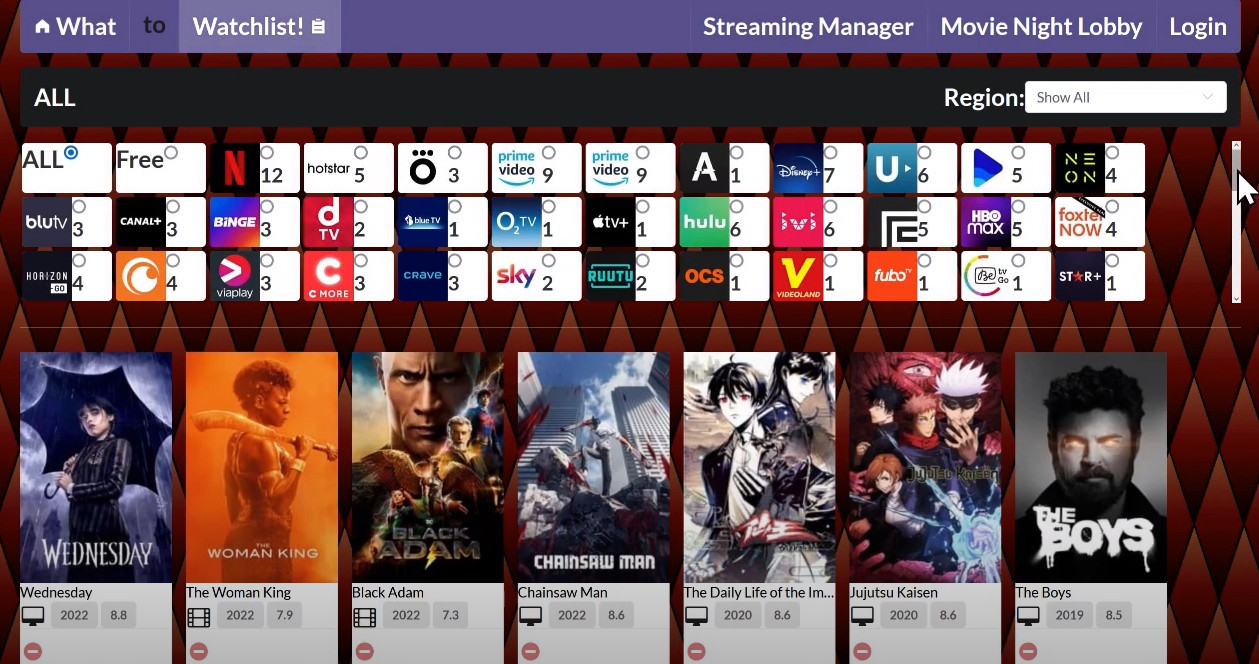
The watchlist page has remained a cornerstone feature since its inception, with its core functionality unchanged. However, it now possesses the added capability of allowing users to specify their streaming region. Serving as the basis for creating a watchlist, the watchlist browser puts streaming knowledge at your fingertips. By keeping track of what you’re looking forward to watching, you can swiftly browse through where you can find it. Just select a streaming service to see how it aligns with your viewing preferences.
While UI enhancements were applied across all pages, the most substantial changes occurred behind the scenes. The watchlist page evolved in tandem with media lists, a concept introduced in the home-search feature. Its evolution was not merely about displaying the watchlist; it had to dynamically return a subset of content based on the selected service and specified region. Accommodating additional features such as a custom streaming service selector, service metrics, and seamless navigation between various lists required flexible design choices.
To meet these diverse needs, I started by decoupling the logic for processing a watchlist by removing it from the view component and making it part of its own robust library-package. This package handles the two main questions we have about a watchlist: what streaming services offer these titles and what titles are available on a streaming service. The function interfaces had a significant amount of configurable options that would be able to satisfy most needs and easily extend functionality for any one-off requirements. Much of this flexibility was achieved by having the UI component pass a MongoDB query that would allow the calling function to define whatever granularity needed for their watchlist and keep any specific concerns within the appropriate component. With all this, the library has done well to adhere to the goal of low coupling and high cohesion in pursuit of maintainable code.
During mobile app testing, a significant performance lag on the watchlist page was identified, which had gone unnoticed on desktop. As the watchlist expanded, the lag became more pronounced. Using browser profiling tools, I pinpointed this down to an inefficient use of the mini-mongo instance. I was going through each streaming service and finding what watchlist titles matched up when I should have been going the other way to find all the streaming services after processing each title. This optimization brought the complexity down to O(n) linear time resulting in a substantial 25x performance speedup, restoring the snappy experience expected from a Progressive Web App (PWA).
My takeaway from the fix was
- I knew better, but the code was convenient to just call some other library
- Some libraries can be really slow, there would have been a definite speedup by keeping the same inefficient implementation without calling mini-mongo
- Wishful thinking that some package is efficiency magic behind the scenes never works; they, like you, work on the concepts of maintainability and reliability, not magic
Movie Night Lobby
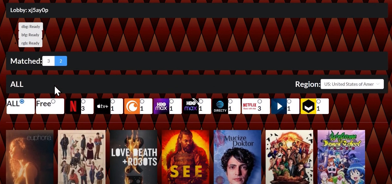
The movie night lobby is for friends to gather and discover shared interests within their watchlists. Designed to offer a structured approach to choosing what to watch, with a much better approach than just opening up Netflix and aimlessly scrolling until people agree on something. Once your friend group has assembled in a lobby, you’ll explore through titles based on how many friends are interested. Just like the watchlist page, you can refine your choices to see whats available for free or on a service somebody’s subscribed to.
Initially conceived as an optional bonus feature, lobbies quickly became a vital means to keep me focused on the app as some other features were dealing with some concerning roadblocks. (refer to Development Blocks and Push Through to Publish.) The need for state synchronization across multiple users presented a welcome challenge, with a new set of concerns.
Inspired by the concept of game lobbies, where someone would open a lobby with their friends, be given a certain amount of time to get things in order and once everyone has readied up your party is set to embark. Much of the complexity in this feature stems from all the state tracking before the party is created.
Task the server has to manage:
- adding new people to a waiting lobby and preventing them from joining an active lobby
- handle user disconnect or logout by verifying user has an active session
- cleaning old or abandoned lobbies
- tracking the time remaining
- limiting the lobby size
- then once all members have readied up the lobby is now active and the state freezes meaning the party is set to begin
Despite its engaging nature, lobby development presented its fair share of challenges. The complexity was far above average and always had you checking if you’d covered every edge case. For that reason I consistently hoped I could set it and forget it; unfortunately I had to revisit the lobby code three more times due to frontend rewrites. Each iteration required a comprehensive review of the system’s intricate state transitions, often involving a whiteboard and finite state automata diagrams to ensure all scenarios were covered.
My familiarity with Meteor’s publish/subscribe model for data synchronization didn’t fully prepare me for implementing server-side synchronization. To mitigate race conditions, I developed semaphore logic that partially relied on single-core server operation to ensure lobby concurrency. I initially thought that this type of problem would normally be addressed in an SQL database, which benefits from ACID (Atomic, Consistent, Isolated, and Durable) principles, using triggers, procedures, and functions to manage such challenges. However, I chose to work with the tools at hand instead. I only discovered the MongoDB equivalent features later, so their implementation will be deferred until the app’s user base grows enough to justify the effort.
Streaming Manager
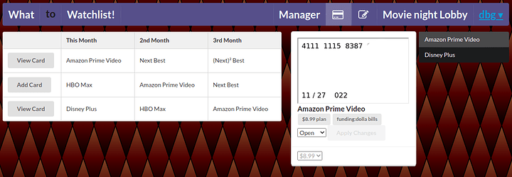
The Streaming Manager is designed to help you track your existing streaming subscriptions and guide you in selecting the right services for your needs. While it shares similarities with the watchlist page, its primary focus is on the most popular streaming services. You can choose the services you’re interested in and delve deeper by comparing their catalogs in terms of size, popularity, and rankings.
The goal is to keep the experience simple, providing functionality to track users’ subscriptions with the potential to integrate privacy.com-like features. Each month, the Streaming Manager will email you a review of how each service is stacking up against the competition, helping you stay informed. Even without additional integrations, the manager can assist you in switching between subscriptions efficiently, allowing you to watch your favorite shows and then switch to a different service the following month. With the average person holding around 4.5 subscriptions, offering streamlined management could potentially save millions for consumers who only need a particular service for a limited time to catch up on specific shows.
Auto Hop Streaming Subscriptions
From the outset, I aimed to create features comparable to those of Privacy.com, offering users an easy way to start and pause their streaming subscriptions. I recalled reading an article about Netflix stopping charges for users who had been inactive for 12 months, presenting Netflix as a “good guy” company. This got me thinking about how different services should work and how they often operate against user interests.
Ideally, users should be able to pay for a month and pause charges if they decide to take a break at the end of the period. However, the only option for this is paying for a month and immediately canceling the subscription, resuming payments whenever desired. Unfortunately, no company voluntarily offers this functionality. Cases like Amazon’s ‘Project Iliad’ show how profitable it is for companies to complicate their cancellation process, as their interests often oppose their users. My goal is to bring users one step closer to having full control over their subscriptions.
After establishing the foundation of the application, I began experimenting with Privacy.com/Lithic sandbox to develop virtual card management features. This allowed me to enable functions such as signing up users for card services, creating virtual cards specific to a service, and pausing/starting payments to facilitate automatic subscription swapping. While not perfect, the goal was to demonstrate that such capabilities were possible.
Currently, this feature is not available in the app due to liability concerns, as managing others’ finances carries higher stakes similar to those faced by banks. However, I remain committed to the possibility of offering this in the future, likely with a slow rollout to ensure all aspects are handled appropriately. This implementation will be revisited once the app’s user base grows enough to warrant the effort and users express interest in signing up for it, providing a tangible payoff that justifies the associated risks.
The Future
Plans for Future Development
The application is currently in good working order, but there is always room for improvement. I plan to develop a companion app that will allow users to manage their virtual cards locally, providing secure payment management and eliminating liability concerns. This mobile app will handle all financial transactions locally and utilize the user’s own Privacy.com account API key to manage virtual cards. It will integrate with apps like What2Watchlist to oversee users’ favorite or most valuable services, making it easy to switch between subscriptions by controlling when to start and stop payments.
Potential Enhancements:
- Trakt TV Integration
- Trakt TV connects with various media apps
- It helps track viewing progress, including episodes watched
- Expanded Watchlist Functionality
- Track seasons and episodes watched
- Notify users of new seasons
- Provide disclaimers regarding the availability of shows and free content:
- Some shows may offer only the first episode of a season for free
- Services may only provide a limited selection of episodes
- The underlying API only indicates that something exists, not its size
- Alternatively, gather and summarize data from other sources to show the percentage of a season available for streaming
- Watchlist Filtering
- Provide filtering options to display only movies or TV shows in the results
I recently spoke with a UX specialist at a conference to gather feedback on reducing user friction in the app. The feedback was positive and constructive, including actionable design changes to guide users toward creating a Watchlist. Doing so will allow users to experience all the great features of What2Watchlist more easily.
These plans are currently on hold. They require the right motivation to implement, and until I have a larger user base, my primary focus remains on meeting my own needs. The application serves its purpose well and stands as a solid showcase of my skills.
I hope to revisit the project soon to incorporate new UX design improvements and to ramp up marketing efforts. I aim to share the app with a larger audience, such as on Reddit, to reach beyond my social circle and test the app’s appeal to a broader user base. Hopefully, this approach will allow the app to gain momentum and attract a reasonable number of users.
Conclusion
The journey of developing What2Watchlist has been an exploration of both the highs and lows of solo project work, emphasizing the importance of persistence and resilience. Taking the time to pursue personal projects is an intrinsically enriching experience of creating something you want to see. Even in the face of any development lapse or roadblocks that have no clear path forward, the drive to get back into it and begin that next step of the project will stay with you. Anytime is the right time to pick a project back up, approaching problems that once seemed insurmountable with a fresh perspective can bring new ideas and solutions to pave a way forward. Looking back, I take great pride in the path taken and the projects end result.
While persistence was a key driver, the isolation of lockdown shed light on the critical value of collaboration and teamwork in achieving larger goals. Although solo projects allow for creative freedom and the opportunity to pursue curiosity, they often lack the structure and direction that comes with working in a team. These moments of curiosity and exploration are essential for personal growth, but a team provides a framework for consistent execution and progress. Upon reflection, I’ve realized that a salary cannot replace passion, and passion does not always translate directly into a salary. Moving forward, I aim to strike a better balance between these truths by engaging in side projects outside of my day job.
My greatest regret was not finding a reliable group to share my journey with, for advice and mentorship. A strong support network can sustain motivation, help maintain focus, and prevent burnout. Despite my robust background in software engineering and ability to build What2Watchlist on my own, the isolation from Covid-19 impacted my focus and productivity. Seeking out meetups and building a social network has made a significant difference in my professional and personal development, and I wish I had pursued this sooner.
In the end, this project has been a testament to setting a goal and achieving it, while also learning new skills and growing as a developer. Through vision, determination, and curiosity, What2Watchlist has been realized as a project with immense potential and serves as an excellent showcase of my capabilities. Though the app may not be growing rapidly, it remains a source of pride and a deeply rewarding journey. Remember that challenges can be overcome with determination and belief in your vision, never give up on what you strive for.
